Case Study:
Milo Banking App
in this project
Product Design
Design Systems
Brand
Information Architecture
Prototyping
1
The project
Milo is a banking app that lets users quickly create a US-based bank account and start sending and receiving money right away. All accounts get a debit card that can be used in contactless payments in physical stores.

Being the only designer in charge for this project, with briefs from the product team, feedback from users and specs by engineers, gave me the chance to address the project's needs in a genuinely holistic approach to every small part of the design process, from early planning to prototyping.
The goal was to stand out by delivering an app that is:
1
Simple to navigate,
2
Quick to check and operate,
3
Memorable and trustworthy via its look and feel.
information architecture
All the app’s features and info were mapped, and with that as base and in combination with some early wireframing, I landed on the simplest navigation possible, placing what would be used the most in the most reachable portion of the screen.
This resulted in two main sections: a Home screen with the latest activity and insights, and an Account screen that merges all transactions and the debit card associated with it. And last but not least, an action button in the center of the bar can be triggered anywhere in the app.


2
foundations + design system

type
ABC Ginto by Dinamo, a geometric/humanist typeface was chosen as Milo’s voice for the system.
Ginto injected just the right amount of character to the tone, and the approachability and friendliness a new product needs to introduce itself, without getting too playful/unserious or sacrificing legibility.

icons
The custom set shares Ginto’s angles and general style, but adheres to conventions to keep them approachable and direct.
Super-specific icon needs, not present in existing sets were tackled. For example, the Account and Card concepts conveyed in the Account section. Specific or not, going custom also lets the set grow independently, keeping its character in every addition.

color
A fresh feel was brought by introducing an abundance of more vivid colors, while staying true to the blue and yellow that already was part of their palette.
A simple yet comprehensive color system was created for the project, where all neutrals, accent and UI colors have different values for light and dark mode.
dimensionality
Neutral colors are used to indicate the order of layers in the design, this means that an object that’s in the front will get more light than an object that’s in the back. To keep this true on both light and dark mode however, I needed to add a neutral color scale based on stacking order (or z-index).
3
app Sections
home
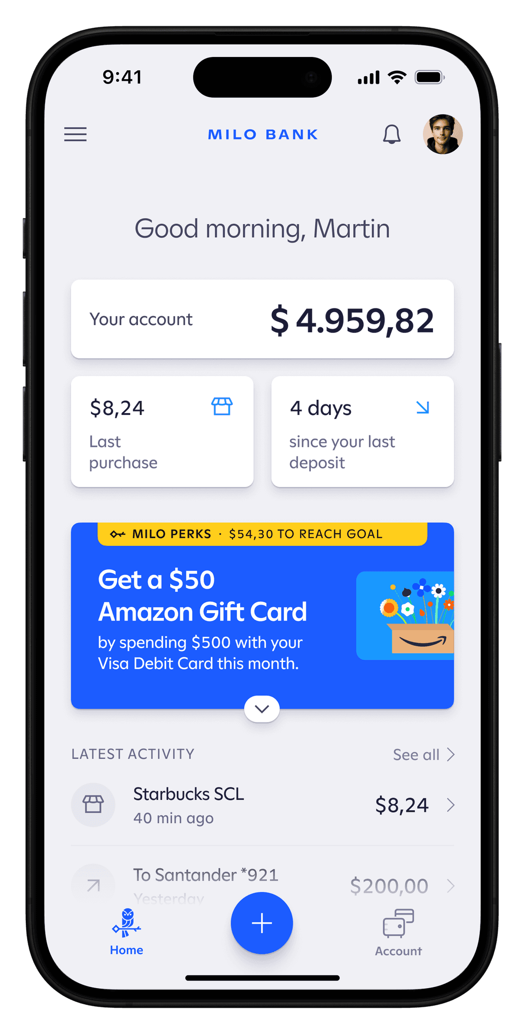
The Home screen greets users and delivers an overview of everything going on in their account. This includes the account balance always fixed on top, followed by summary units that will change depending on the user’s activity. Some who use their debit card daily will appreciate having the last purchase highlighted here, but for other users who just use their Milo account to receive money from US-based accounts and sending to their local accounts, something like a sum of all money sent out in that month can be more useful.


There's also space for cards that shows progress made toward a goal as incentive to use features. These cards, depending on the user, can also show things like a checklist of tasks for new accounts, insights on spending, suggestions, and more. These cards can be expandable so that other important content below them remains visible.
These cards can be expandable so that other important content below them remains visible.
account + card
The Account section shows the account balance and the full list of transactions.
Living behind that is the account’s Card. When tapped, the transaction list is pushed down to show the full card and its details, as well as options to set restrictions based on amount, type of merchant, and more.
hide card
reveal card


Transactions
All details regarding a purchase or a transfer are housed here.
A pattern in all transactions is that all have a source, a destination, an amount, a status, and a timestamp. This is shown in the summary unit, with approachable/natural language (“from”, “to”, “when”) that instantly lets you know what took place without technical or bank-like language that almost seems confusing by design.
A second pattern was also clear: all transactions are actually a sequence of events that end in either completion or failure. So it made sense to display these events as a timeline triggered by the transaction’s status shown at the top of the screen. This timeline can indicate information such as the origin of a transaction, the different entities involved, or even when a transaction is estimated to be complete.
Action Button + transfers
The action button keeps all main tasks that can be performed in Milo easy to reach, short to complete from start to finish, and clear and thorough with all useful information on display, while still keeping everything compact.
In the example shown, completing a transfer to another Milo account takes 7 only taps.
Subtle transitional animations both during and right after the transfer process go beyond simply decorating the UI, communicating users what’s taking place, as shown in the example: after a successful transfer, the latest transactions list in the home screen updates by pushing down the (now) second most recent transaction, and simultaneously updating the account balance. A quick, non-obstructive way of showing how what you just did affects your account.
♥︎
clsoing thoughts
Watching all the design pieces come together was in some way both extremely gratifying and at the same time not shocking at all. By having a consistent and trustworthy design process,
Case Study:
Milo Banking App
in this project
Product Design
Design Systems
Brand
Information Architecture
Prototyping
1
The project
Milo is a banking app that lets users quickly create a US-based bank account and start sending and receiving money right away. All accounts get a debit card that can be used in contactless payments in physical stores.
Being the only designer in charge for this project, with briefs from the product team, feedback from users and specs by engineers, gave me the chance to address the project's needs in a genuinely holistic approach to every small part of the design process, from early planning to prototyping.
The goal was to stand out by delivering an app that is:
1
Simple to navigate,
2
Quick to check and operate,
3
Memorable and trustworthy via its look and feel.
information architecture
All the app’s features and info were mapped, and with that as base and in combination with some early wireframing, I landed on the simplest navigation possible, placing what would be used the most in the most reachable portion of the screen.
This resulted in two main sections: a Home screen with the latest activity and insights, and an Account screen that merges all transactions and the debit card associated with it. And last but not least, an action button in the center of the bar can be triggered anywhere in the app.
2
foundations + design system
type
ABC Ginto by Dinamo, a geometric/humanist typeface was chosen as Milo’s voice for the system.
Ginto injected just the right amount of character to the tone, and the approachability and friendliness a new product needs to introduce itself, without getting too playful/unserious or sacrificing legibility.
icons
The custom set shares Ginto’s angles and general style, but adheres to conventions to keep them approachable and direct.
Super-specific icon needs, not present in existing sets were tackled. For example, the Account and Card concepts conveyed in the Account section. Specific or not, going custom also lets the set grow independently, keeping its character in every addition.
color
A fresh feel was brought by introducing an abundance of more vivid colors, while staying true to the blue and yellow that already was part of their palette.
A simple yet comprehensive color system was created for the project, where all neutrals, accent and UI colors have different values for light and dark mode.
dimensionality
Neutral colors are used to indicate the order of layers in the design, this means that an object that’s in the front will get more light than an object that’s in the back. To keep this true on both light and dark mode however, I needed to add a neutral color scale based on stacking order (or z-index).
3
app Sections
home
The Home screen greets users and delivers an overview of everything going on in their account. This includes the account balance always fixed on top, followed by summary units that will change depending on the user’s activity. Some who use their debit card daily will appreciate having the last purchase highlighted here, but for other users who just use their Milo account to receive money from US-based accounts and sending to their local accounts, something like a sum of all money sent out in that month can be more useful.
There's also space for cards that shows progress made toward a goal as incentive to use features. These cards, depending on the user, can also show things like a checklist of tasks for new accounts, insights on spending, suggestions, and more. These cards can be expandable so that other important content below them remains visible.
These cards can be expandable so that other important content below them remains visible.
account + card
The Account section shows the account balance and the full list of transactions.
Living behind that is the account’s Card. When tapped, the transaction list is pushed down to show the full card and its details, as well as options to set restrictions based on amount, type of merchant, and more.
hide card
reveal card
Transactions
All details regarding a purchase or a transfer are housed here.
A pattern in all transactions is that all have a source, a destination, an amount, a status, and a timestamp. This is shown in the summary unit, with approachable/natural language (“from”, “to”, “when”) that instantly lets you know what took place without technical or bank-like language that almost seems confusing by design.
A second pattern was also clear: all transactions are actually a sequence of events that end in either completion or failure. So it made sense to display these events as a timeline triggered by the transaction’s status shown at the top of the screen. This timeline can indicate information such as the origin of a transaction, the different entities involved, or even when a transaction is estimated to be complete.
Action Button + transfers
The action button keeps all main tasks that can be performed in Milo easy to reach, short to complete from start to finish, and clear and thorough with all useful information on display, while still keeping everything compact.
In the example shown, completing a transfer to another Milo account takes 7 only taps.
Subtle transitional animations both during and right after the transfer process go beyond simply decorating the UI, communicating users what’s taking place, as shown in the example: after a successful transfer, the latest transactions list in the home screen updates by pushing down the (now) second most recent transaction, and simultaneously updating the account balance. A quick, non-obstructive way of showing how what you just did affects your account.
♥︎
clsoing thoughts
Watching all the design pieces come together was in some way both extremely gratifying and at the same time not shocking at all. By having a consistent and trustworthy design process,